Quick summary
Most footwear e-commerce stores lose the majority of their visitors not because of poor traffic, but because of a poor store experience. Navigation that hides categories, product pages that leave too many questions unanswered, and checkout flows that create unnecessary friction are what stand between a visitor and a purchase. So, improving store navigation, product visuals, sizing clarity, and checkout flow can significantly increase conversions from the visitors already coming to your site.
Getting Traffic Is Only the Beginning
70% of all e-commerce visitors abandon their shopping cart. For footwear brands, buyers leave because they can’t visualize the product properly, feel unsure about sizing, or struggle to find products quickly.
Most footwear stores invest heavily in driving traffic through ads, SEO, and social media, only to lose the majority of those visitors in the store itself. This is because the navigation is unclear, the product pages answer too few questions, and the checkout creates unnecessary friction.
Conversion rate optimization is the work of fixing that gap. Not by spending more on traffic, but by making your store work harder for the visitors already arriving. Here we’ve shared 11 strategies built specifically for footwear e-commerce, focusing on improving navigation, collection pages, product pages, and checkout.
Why Listen To Us?
Fibbl is a 3D commerce platform built exclusively for footwear and bag brands. We’ve scanned over 18,000 shoes into photorealistic 3D assets and recorded more than 50 million consumer interactions with 3D and AR product experiences across our client network.
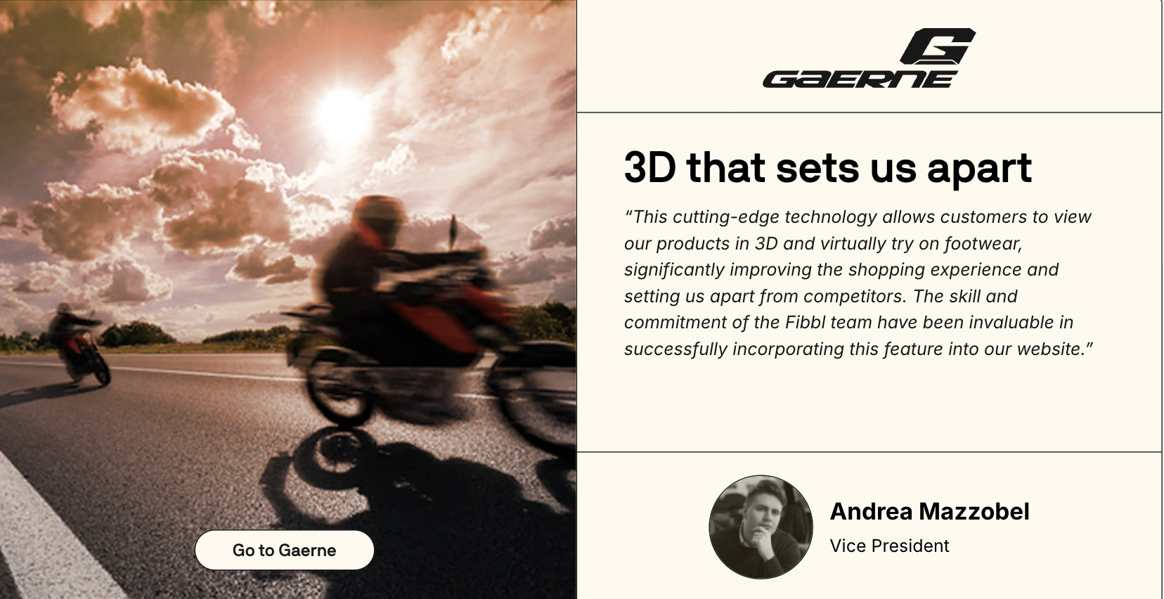
We work with brands including GANT, ECCO, LØCI, Samsonite, and TUMI, giving us a front-row seat to what actually moves the needle on footwear conversion rates. The strategies in this guide come directly from that experience.
Strategy 1: Use a Visual Mega Menu
Most footwear stores rely on text-only navigation. Buyers have to read through category names, mentally map where they want to go, and click through to find what they’re looking for.
A visual mega menu replaces text-only navigation with a layout that combines category names with images, showing buyers exactly what’s in each section before they click.
For footwear brands, this is particularly effective because shoes are a visual product. A buyer scanning a menu processes a thumbnail of a running shoe faster than the words “Men’s Athletic Footwear” ever could.
Here’s what a text-only navigation looks like, clean, but it makes buyers work harder than necessary:
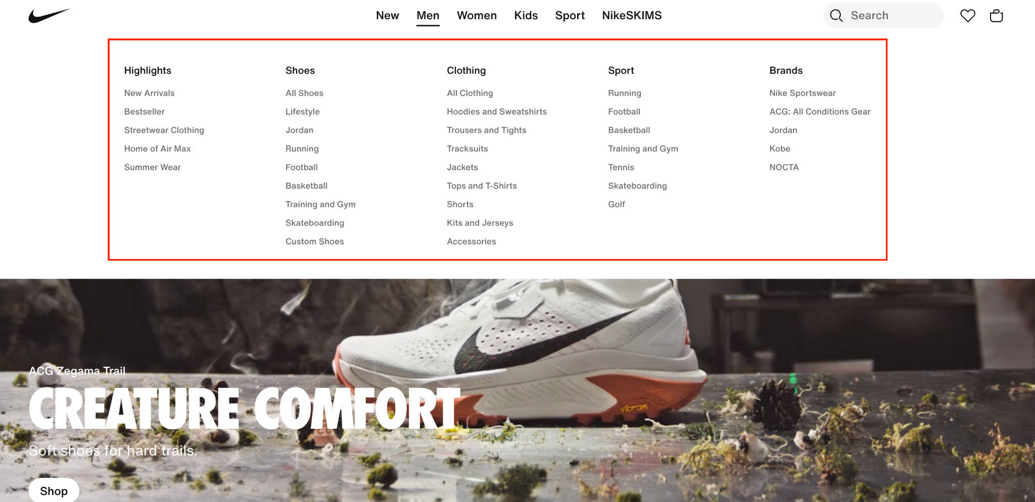
Compare that to this approach, where product images sit alongside category links, giving buyers immediate visual context before they click:
The strongest mega-menu structure for footwear stores is:
- Use product imagery for every primary category so buyers instantly recognize what each section contains.
- Visually separate subcategories with thumbnails or featured product images instead of long text lists.
- Reserve text-only links for deeper navigation layers where buyers already know exactly what they are looking for.
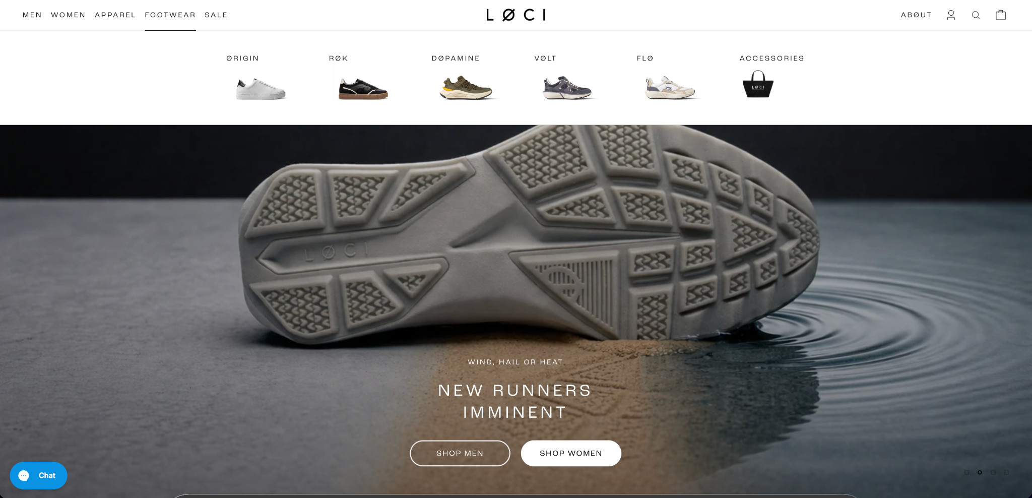
Strategy 2: Partially Expanding the Hamburger Menu With Important Categories on Mobile
On mobile, most footwear stores collapse everything behind a hamburger icon, three lines in the corner that reveal nothing until tapped. For a buyer who knows exactly what they want, that extra step is unnecessary friction.
Here’s what the common approach looks like: a hamburger icon with all categories hidden behind it, giving the buyer no visual cue about where to go:
And here’s a better approach:
This brand keeps the hamburger for deeper navigation but surfaces the most important categories immediately, with no tapping required. The fix for your store follows the same logic:
- Identify your highest-traffic collections from Google Analytics.
- Surface your top 3–5 as visible, tappable links in the mobile header.
- Keep the hamburger for secondary navigation and filters.
- Prioritize gender splits, sales, and new arrivals as default starting points.
Strategy 3: Show Multiple Product Images on Collection Pages
When a buyer lands on your collection page, they make split-second decisions about which products to click. A single static image per product gives them almost nothing to work with, as it has one angle, one color, and a lot of uncertainty.
Showing multiple images per product directly on the collection page changes that. Different angles, different colorways, and lifestyle context are all visible without a single click. Buyers who can see more convert more.
The practical challenge is generating enough high-quality imagery to make this work across an entire catalog. Traditional photoshoots are expensive, slow, and hard to scale across hundreds of SKUs every season.
Fibbl’s AI packshot service addresses this directly:
- Generates photorealistic product images from 3D models.
- Covers any angle, lighting condition, and background color on demand.
- Preserves material accuracy down to leather texture, patent sheen, and mesh weave.
- Updates instantly when product designs change.
- Scales across an entire catalog, season after season.
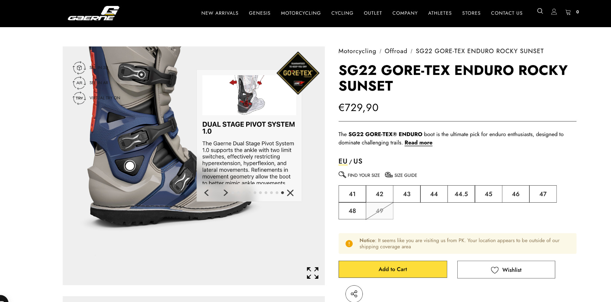
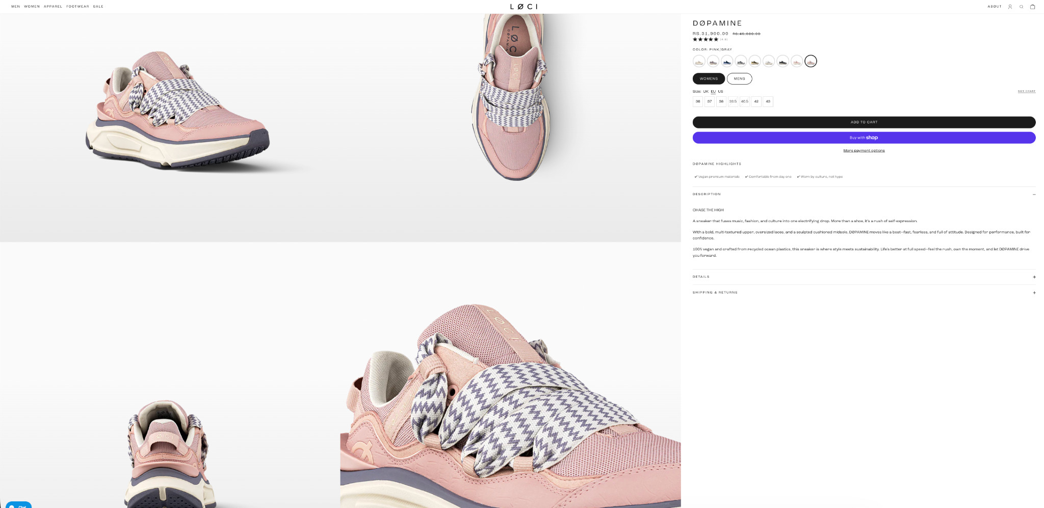
Strategy 4: Add Immersive Product Experiences to Your Product Pages
Static images leave too many questions unanswered. How does the sole look? What does the leather texture actually feel like? Will this colorway work on my foot? Buyers who can’t answer these questions don’t convert. They leave.
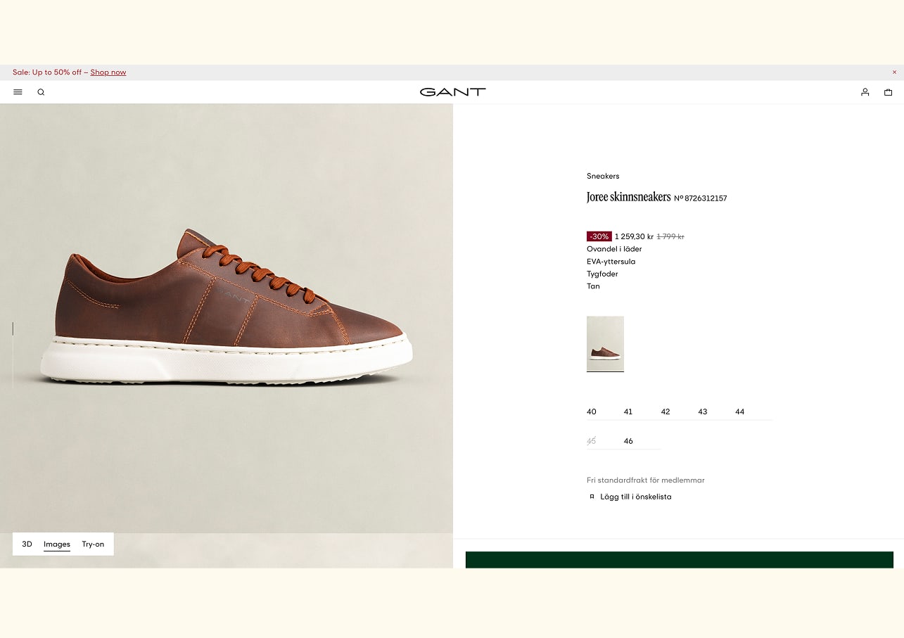
Here’s what a fully optimized footwear PDP looks like with Fibbl:

3D viewer and AR/VR
A 3D viewer lets buyers rotate the shoe 360 degrees and inspect it from any angle, sole, heel, upper, or toe box, directly on the product page. AR takes it further, letting buyers point their phone camera at their feet and see the shoe on them in real time.
AI lifestyle images
Standard packshots show the product on a white background. Whereas lifestyle images show it in context, worn, and styled, in a real environment. Fibbl generates photorealistic lifestyle images directly from 3D models, placing the actual product accurately into any scene without a photoshoot.
Detailed add-on images
Some purchase decisions come down to a specific detail, like the stitching, the outsole material, or the lining finish. Fibbl’s add-on imagery accentuates these details with close-up, high-resolution shots that standard product photography rarely captures, giving buyers the visual confidence to commit.
Together, these elements answer every visual question a buyer might have before purchasing. They remove the need to leave the page, search for more photos, or risk buying something they can’t fully evaluate.
Strategy 5: Add a Shoe Sizing Chart on Product Pages
Sizing is the single biggest source of purchase anxiety for online footwear buyers. Unlike clothing, shoes have very little tolerance for error. Half a size too small, and the product gets returned. That uncertainty is one of the most common reasons buyers add a shoe to their cart and then abandon it.
An accessible sizing chart on the product page removes that uncertainty before it becomes a reason not to buy. Not a link that opens a separate page, not a generic chart buried in the footer.
Here’s a good example of this done well:
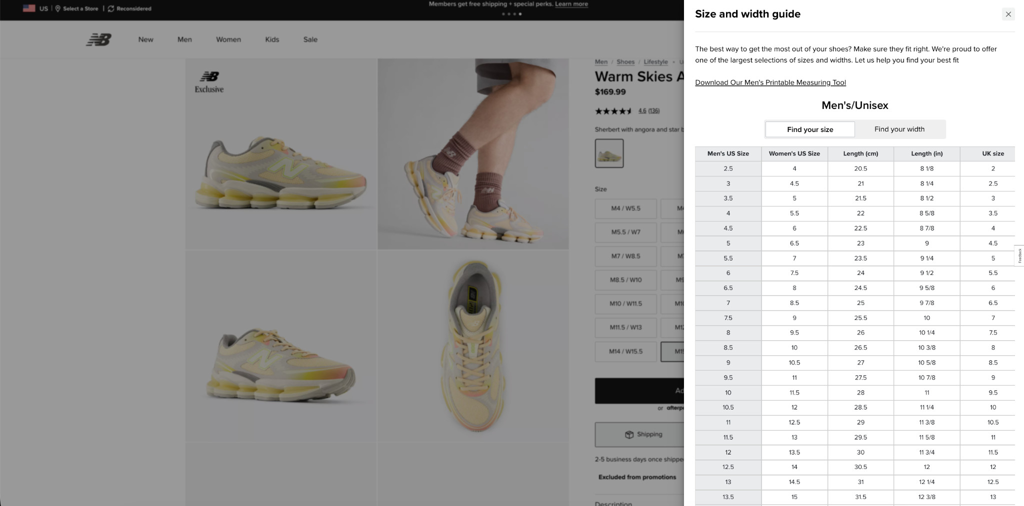
A well-implemented sizing chart should:
- Be triggered directly from the product page without opening a new tab or page.
- Show measurements across multiple sizing systems (US, EU, UK) at a minimum.
- Include actual foot length in both centimeters and inches.
- Separate width guidance for buyers with specific fit needs.
- Be specific to the product where fit varies from standard sizing.
The fewer questions a buyer has about fit, the more likely they are to complete the purchase.
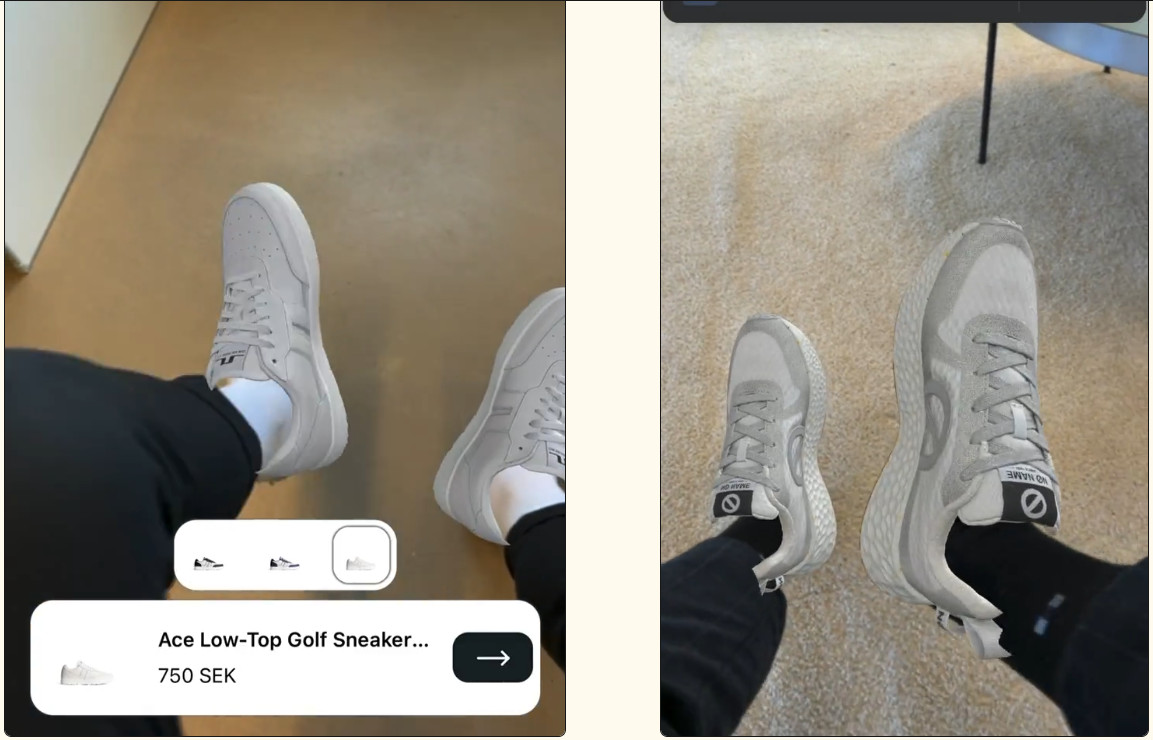
Strategy 6: Add Virtual Try-On to Your Product Pages
One of the biggest barriers to buying shoes online is the inability to try them on. Buyers want to know how a shoe looks on their feet (color, proportions, style) before committing to a purchase. Without that, many will browse, hesitate, and leave.
Virtual try-on brings the fitting room to the product page. Using AR through a mobile camera, buyers can see exactly how a shoe looks on their own foot in real time. They can switch between colorways, check proportions, and build the visual confidence they need to add to the cart.
Here’s what AR looks like on a live footwear product page:
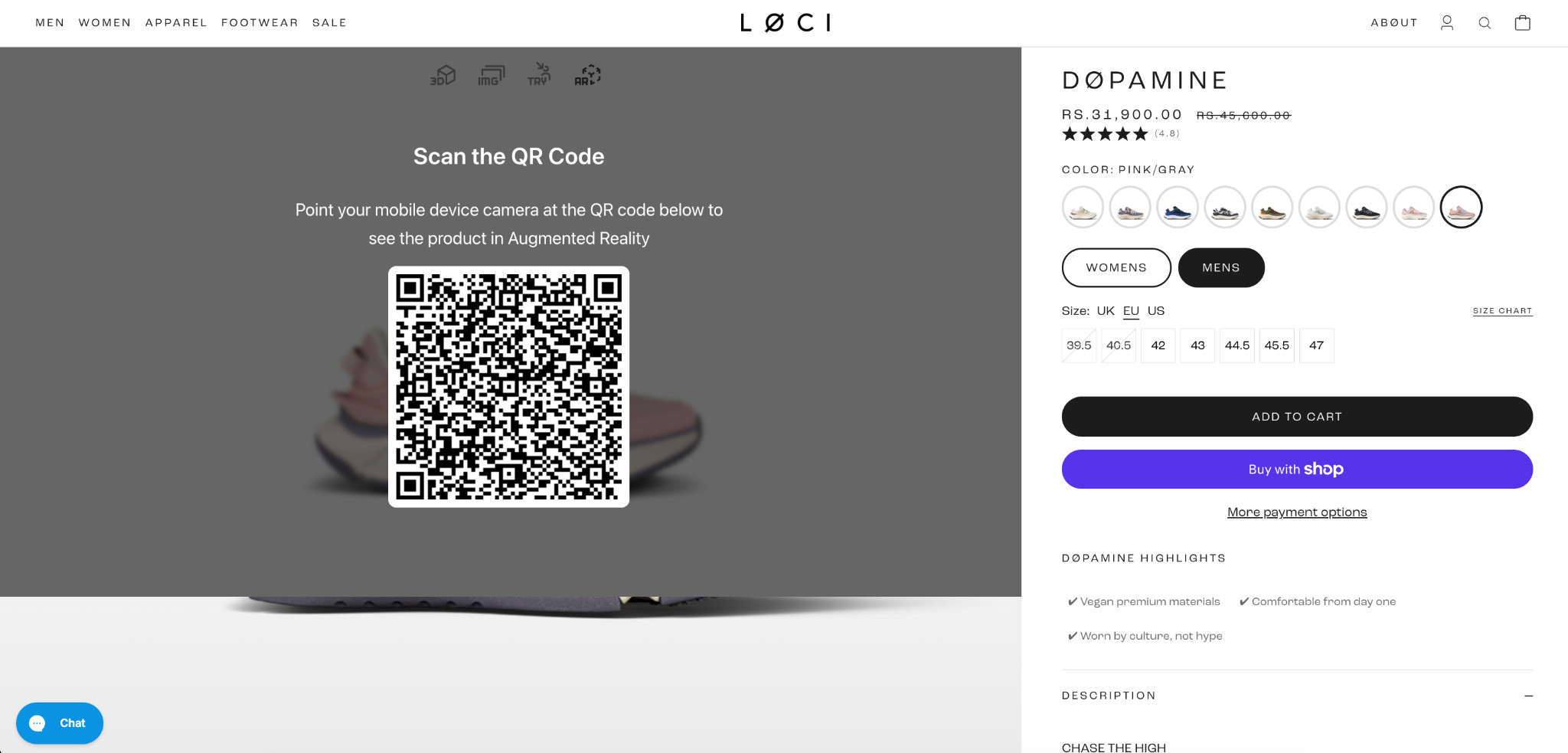
And here’s the experience on the buyer’s phone:
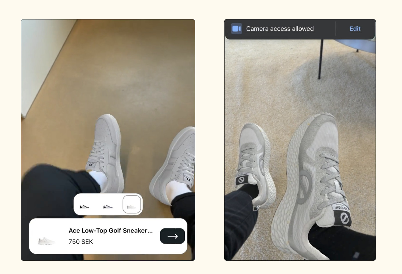
The buyer scans a QR code from the product page, points their camera at their feet, and sees the shoe on them instantly, no app download required. Colorway switching is built in, so a buyer considering multiple options can compare them on their own foot before deciding.
Fibbl integrates virtual try-on directly into Shopify product pages alongside standard product imagery, keeping the experience inside the existing buying flow.
Strategy 7: Show Product Differentiators Above the Fold
Users spend about 57% of their page-viewing time above the fold. That means most buyers make a purchase decision based almost entirely on what they see before scrolling.
Yet many footwear brands waste that space on generic layouts that fail to answer the three questions buyers immediately care about:
- Why should I care?
- Why should I buy this instead of another option?
- Why should I trust this product?
A common mistake is pushing product details and specs below the fold, forcing buyers to scroll before they get the information that should be helping close the sale. By the time they find it, many have already left the page.
Here’s a stronger approach:
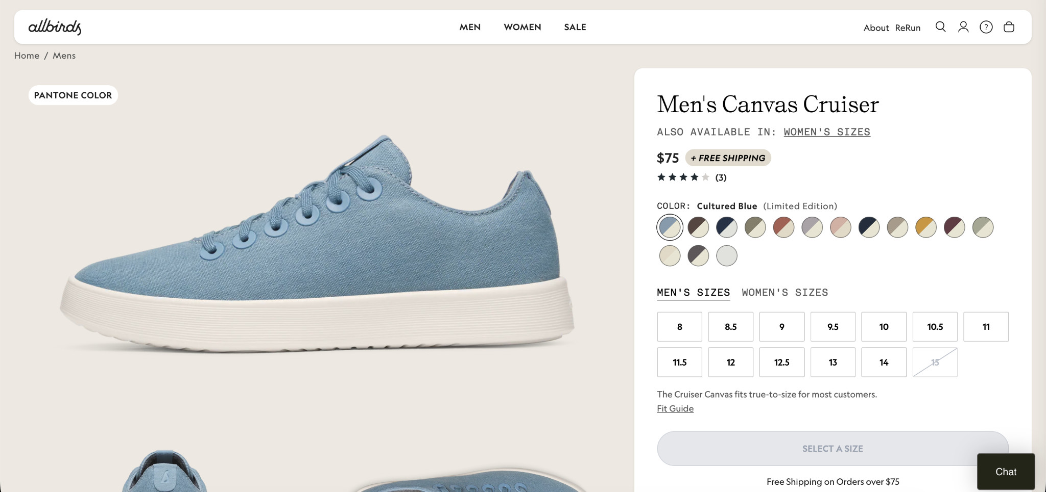
Allbirds surfaces a free shipping badge, a fit confidence signal, an urgency cue, and trust elements immediately, without forcing the buyer to scroll.
Two additional elements that make a significant difference:
- Benefit-focused secondary images: show the shoe in real use and highlight important features instead of relying only on standard white-background product shots.
- Testimonials above the fold: place a real customer review addressing a common buyer concern where every visitor sees it immediately.
Strategy 8: Show Delivery Dates on Product Pages
Most footwear stores display shipping speed as a range, such as “3–5 business days.” The problem is that buyers do not think in shipping windows. They think about actual dates.
A delivery estimate like “Arrives Friday, May 8” removes uncertainty immediately and answers the real question buyers care about: When will this get here?
Here’s how Adidas handles it:
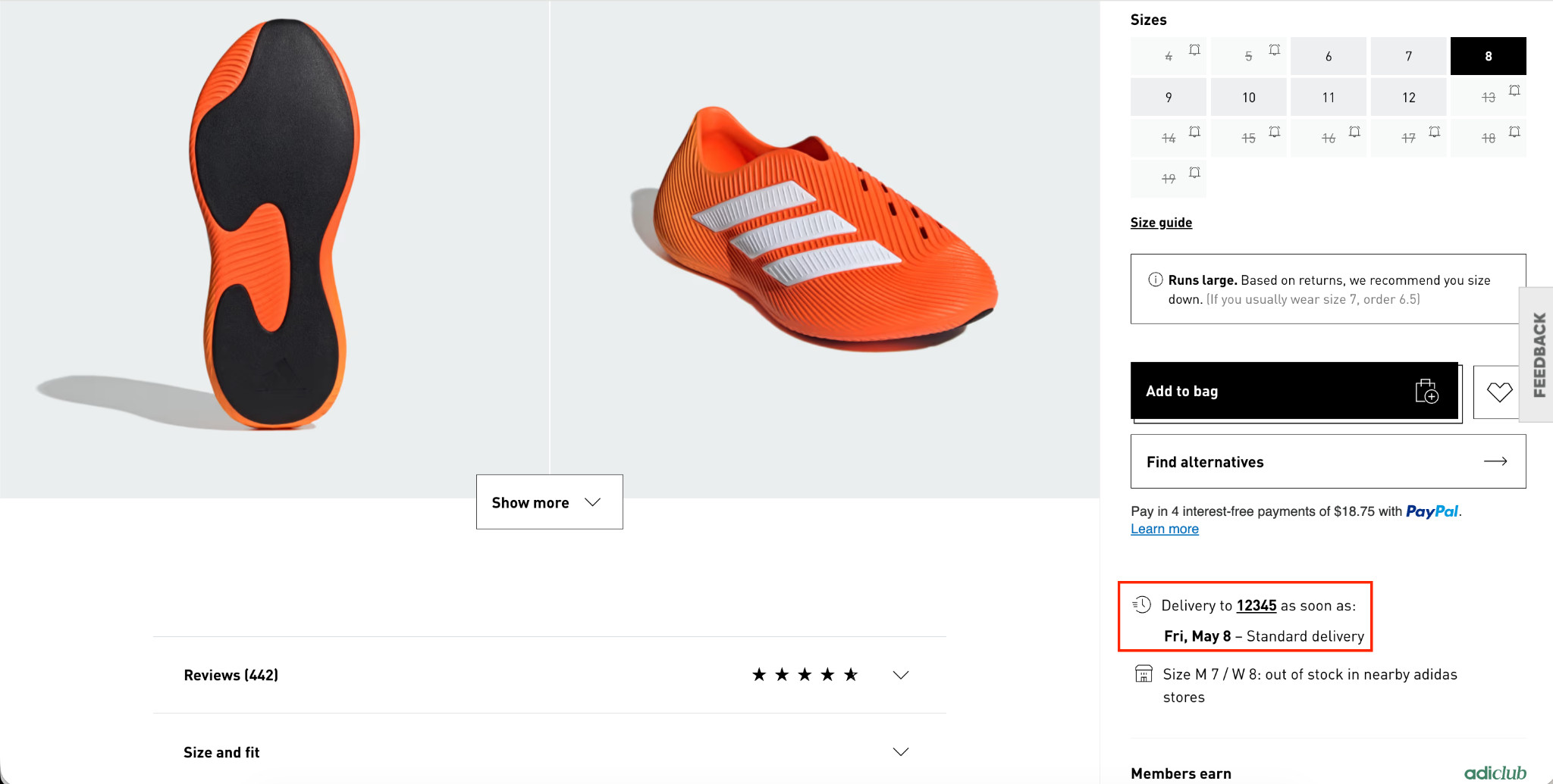
When footwear is being purchased for a specific event, trip, sport, or gift, delivery timing becomes a major factor in the buying decision. A clearly visible delivery date can encourage buyers to complete the purchase instead of leaving to compare shipping options on other sites.
The strongest delivery messaging:
- Shows a specific arrival date instead of a shipping range.
- Appears directly on the product page, not only at checkout.
- Updates dynamically based on location and cutoff times.
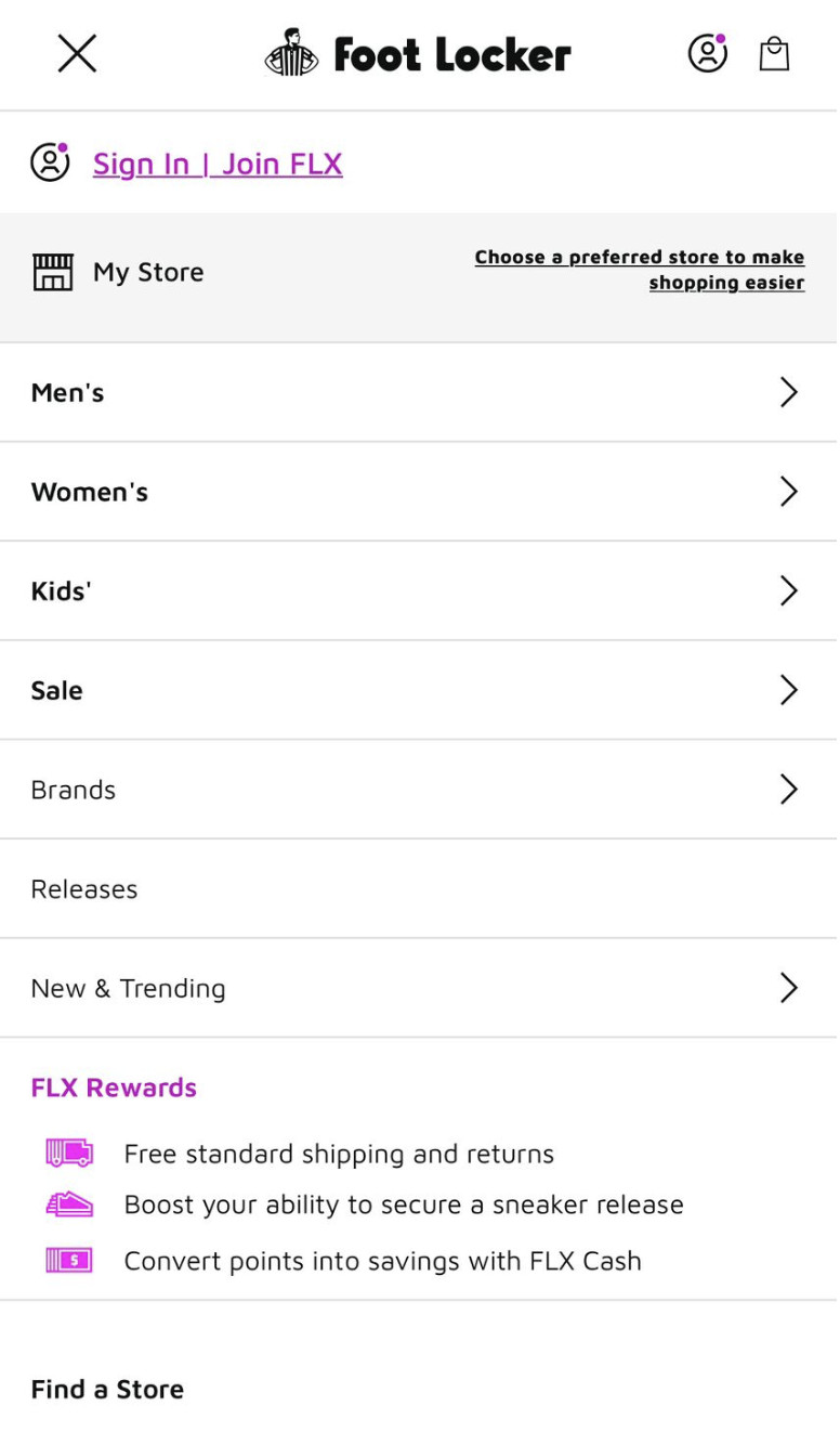
Strategy 9: Show Calculated Discounts on Product Pages
Most footwear stores show a sale price and a crossed-out original price. That’s standard. What most stores don’t do is show the buyer exactly how much they’re saving in real numbers, and that gap costs conversions.
“Was $155, now $89.99” tells a buyer the price dropped. “Save $65” tells them what they’re getting. The second version is more compelling because it frames the discount as a concrete gain rather than just a lower number. Buyers respond to savings they can quantify.
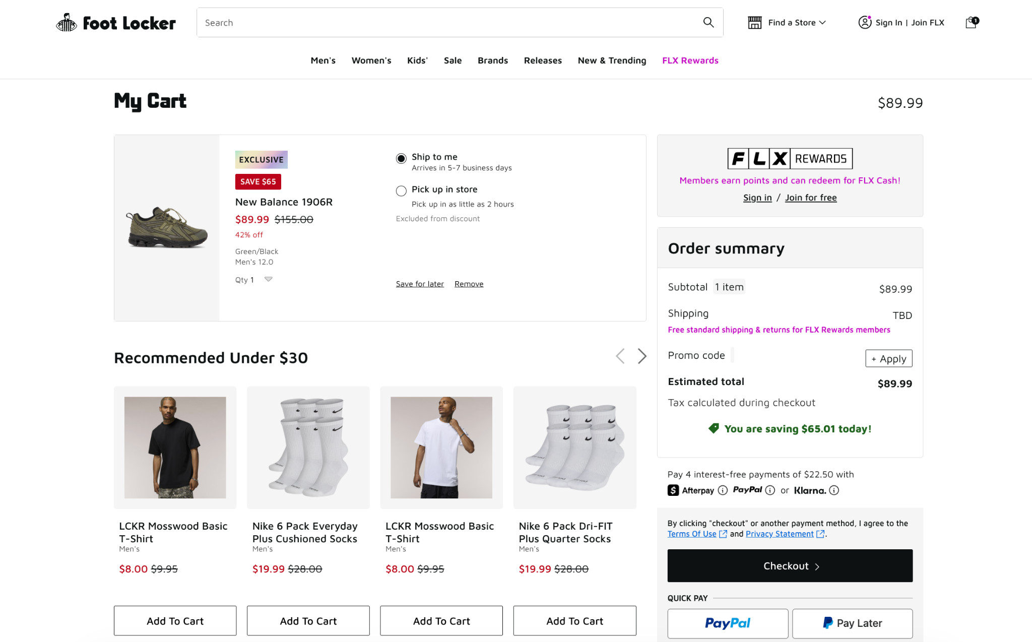
Here’s how Foot Locker does it:
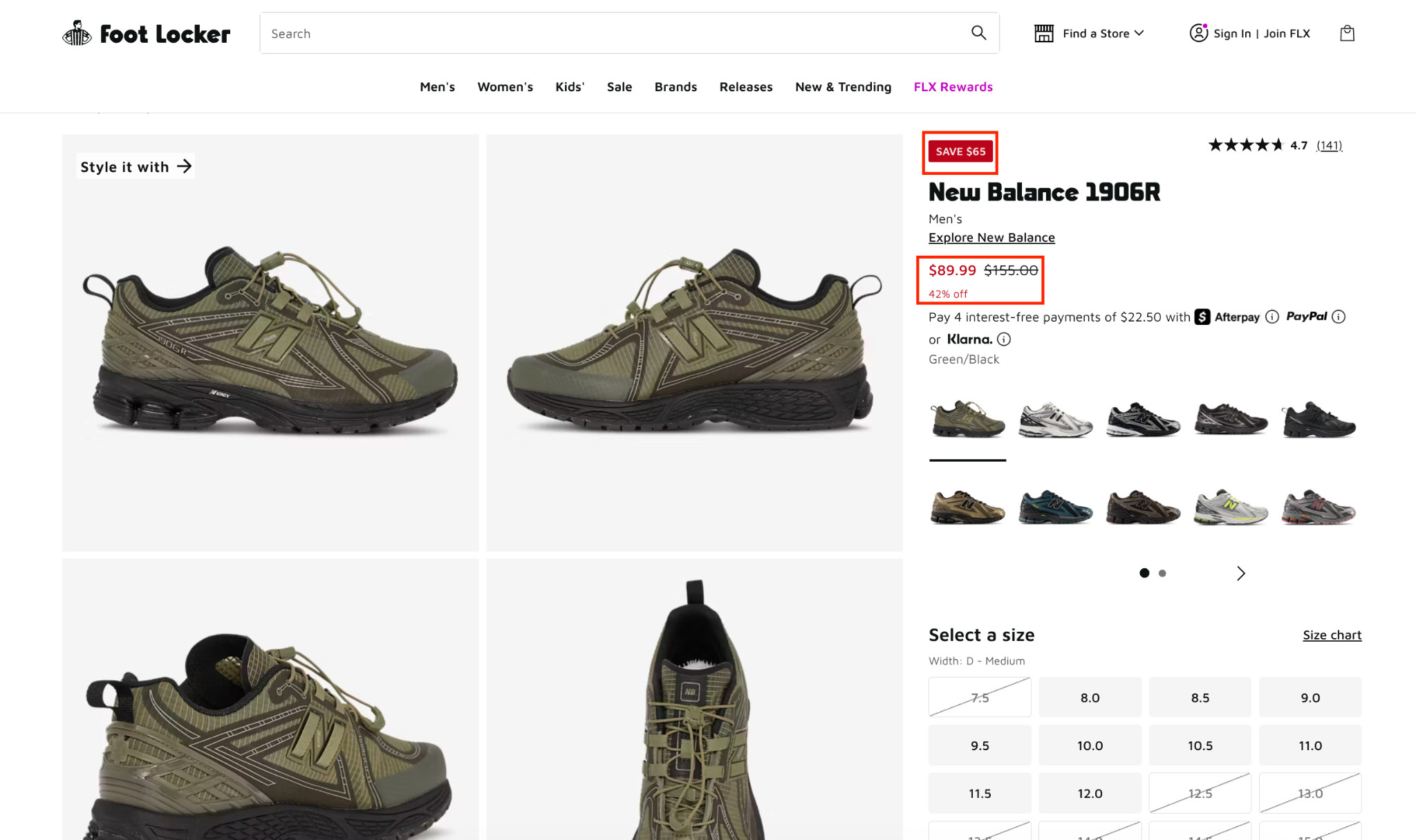
Three discount elements working together (dollar savings, original price, and percentage off) give buyers every possible way to process and justify the savings. Place them prominently above the fold near the price and add-to-cart button so the value is immediately visible.
Strategy 10: Add Checkout Goals on the Cart Page
Most cart pages simply show what the buyer added and push them toward checkout. But the cart is one of the highest-intent stages in the entire shopping journey, making it the ideal place to increase order value before the purchase is completed.
Here’s what a checkout goal looks like in the cart drawer immediately after adding a product:

The checkout goal appears the moment a product is added, with a progress bar showing how close the buyer is to free shipping. On the full cart page:
Savings confirmations and low-cost product recommendations make it easy to increase cart value without adding much friction. For footwear brands, this works particularly well with low-cost, relevant, and easy-to-add accessories, socks, shoe care products, and insoles.
Strategy 11: Add a Visual Search Bar With AI-Powered Recommendations
Most footwear store search bars do the bare minimum by simply returning a list of results after a buyer types a query and presses search. There are no suggestions, visual previews, or guidance. For buyers who aren’t sure exactly what they’re looking for, a blank search bar is a dead end.
A visual search bar with AI-powered recommendations changes this in two ways:
- First, it shows search term suggestions as the buyer types, so buyers who aren’t sure what to search get immediate direction.
- Second, related products appear as visual thumbnails in real time, with name, category, and price visible before the buyer even completes their search.
Here’s what this looks like in practice:
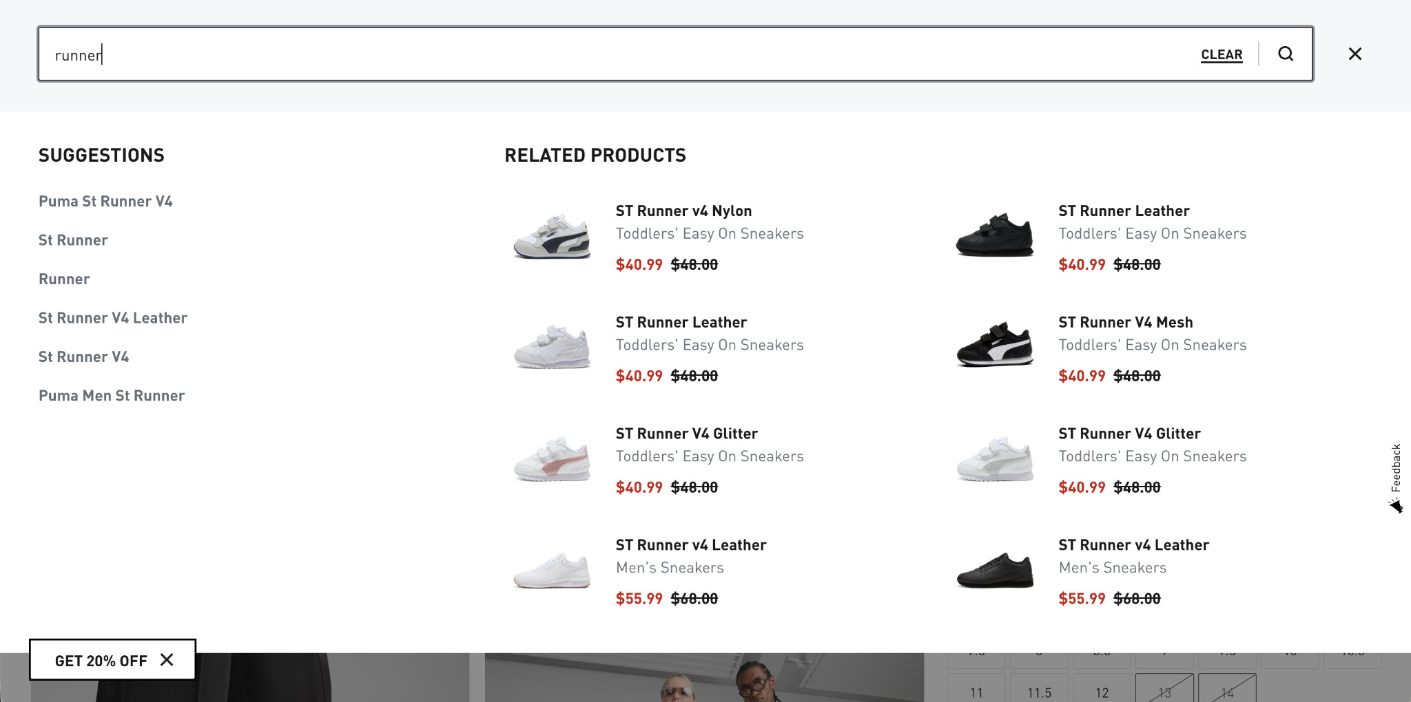
Buyers can see and evaluate products the moment they start typing, without loading a new page, completing a search, or any additional friction. The less a buyer has to think and click, the closer they are to a purchase decision.
For Shopify footwear stores, several apps support this functionality, including Searchanise, Boost Commerce, and Searchpie, all of which offer visual search with real-time product recommendations.
Start Converting the Traffic You Already Have
Most footwear e-commerce stores lose buyers because the shopping experience creates too much uncertainty. Though the strategies in this guide help reduce that hesitation and make it easier for buyers to purchase with confidence. For footwear brands, one of the biggest factors is product visualization. Buyers want to see shoes from every angle, inspect details closely, and understand how they will look before buying online.
That’s where Fibbl gives footwear and bag brands immersive 3D product experiences, AR virtual try-on, AI lifestyle images, and detailed visuals. All these features help shoppers feel more confident about purchasing, and this can lead to higher conversions, better engagement, and fewer returns.
Start with Google Analytics and identify your highest-traffic pages with the lowest conversion rates. Those are your biggest opportunities. Fix those first, measure the impact, then move to the next.
For product pages specifically, if buyers can’t fully visualize your shoes before purchasing, no amount of optimization elsewhere will fully compensate for that gap.
That’s where Fibbl helps. It gives footwear and bag brands immersive 3D product experiences, AR virtual try-on, AI lifestyle images, and detailed visuals. This helps shoppers feel more confident about purchasing, and can lead to higher conversions, better engagement, and fewer returns.
Moreover, Fibbl offers a free product scan. So, footwear brands can see exactly what 3D product experiences look like on their own catalogs, before committing to anything. Get your free product scan.
If you’re also working on building the traffic that feeds your store:
Read next: SEO for Shopify footwear stores: 9 strategies to drive sales
Frequently Asked Questions
What is a good conversion rate for a footwear e-commerce store?
Average e-commerce conversion rates typically fall between 1–3%. Footwear stores that invest in strong product visualization, clear sizing guidance, and frictionless checkout consistently outperform this range.
Rather than benchmarking against an industry average, track your own baseline and measure improvement from each optimization you implement.
Which conversion optimization strategy has the biggest impact for footwear brands?
Product visualization consistently delivers the highest impact for footwear because it addresses the core purchase barrier: buyers can’t try shoes on through a screen.
Brands that implement 3D viewers and virtual try-on see measurable lifts in both conversion rate and time spent on product pages, alongside reductions in return rates.
How long does it take to see results from CRO changes?
Simple changes like adding delivery dates, sizing charts, and discount callouts can show results within days if you’re tracking conversions closely. Larger changes, such as navigation redesigns or 3D product experiences, take 2–4 weeks to gather enough data to measure accurately. Always test one change at a time, where possible, so you can attribute results clearly.